Choosing paint colours for the exterior of a house is an exciting yet challenging task. Above all, choosing paint colours for your home's exterior is a creative process, and it's important to enjoy the journey.
Take your time, gather inspiration, and consult with professionals if needed as choosing the right colour palette for the exterior of your house can significantly impact its overall appearance and curb appeal.
Pick you perfect colour palette
Once you've decided it's time to paint the exterior of your house follow these three easy steps to help you decide on an exterior paint palette that pops!
1. Start with the masonry colour
As your walls are the biggest surface area to decorate, decide on this colour first.
We also recommend that you test a small patch of your favourite colour in situ, as different light conditions and surroundings can change how the shades look.
2. Think about trim
Painting the outside of your home isn’t just about rolling paint over brick, concrete or pebble dash walls – there’s also woodwork and timber cladding to think about.
And don’t forget the trim, a material that edges the windows and doors of your home, as well as fascias, soffits and barge boards that run along the lower edge of the roof.
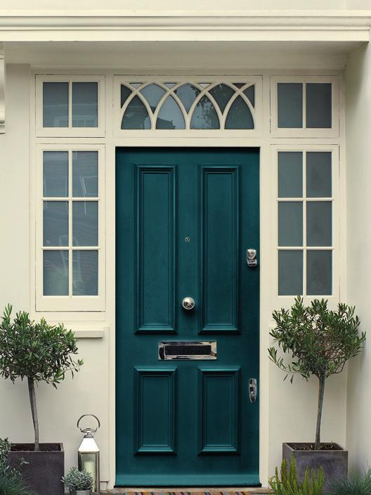
3. Add an accent colour
Your front door is a place where you can have a bit of fun with colour. Their smaller size means they can take on bolder shades with ease and allow room for experimentation if you’ve never played with brighter colours before.
When choosing an accent shade for metalwork and railings, looking at the colours used on the houses in your area can be a great source of inspiration.
Where to get inspiration when choosing a colour scheme
Consider the following tips for more ideas on picking the perfect colour scheme.
- Local neighbourhood: Consider the neighbourhood and surroundings of your home. Choose colours that harmonise with the overall aesthetic of the area while still allowing your house to stand out. Be mindful of any homeowner association guidelines or restrictions.
- Architectural Style: Take into account the architectural style of your home. Different styles have traditional colour palettes that can guide your choices. Research examples of houses with similar styles to gather inspiration.
- Personal Taste and Trends: Ultimately, trust your personal taste and preferences. While trends can be a source of inspiration, remember that your home's exterior should reflect your own style and personality. Strive for a timeless look that will withstand changing trends.
- Sample Testing: Purchase sample pots of your chosen colours and test them on a small section of your home's exterior. Assess how they look in different lighting conditions and alongside other elements like roof colour, trim, and landscaping. This will help you visualise the final result before committing.
- Online Resources: Browse online platforms and websites dedicated to home design and exterior color schemes. Look for curated galleries, color visualizers, and virtual tools that allow you to experiment with different combinations.
- Paint Manufacturers: Many paint manufacturers offer pre-designed colour schemes and curated collections specifically for exteriors. These colour palettes are often carefully crafted by design professionals and can provide a starting point for your own scheme.
More inspiration with Dulux Weathershield
Take inspiration from the Dulux Weathershield colour chart with over 600 shades to choose from. We've highlighted several timeless combinations for exterior colour palettes using shades grouped together by tone and surface.
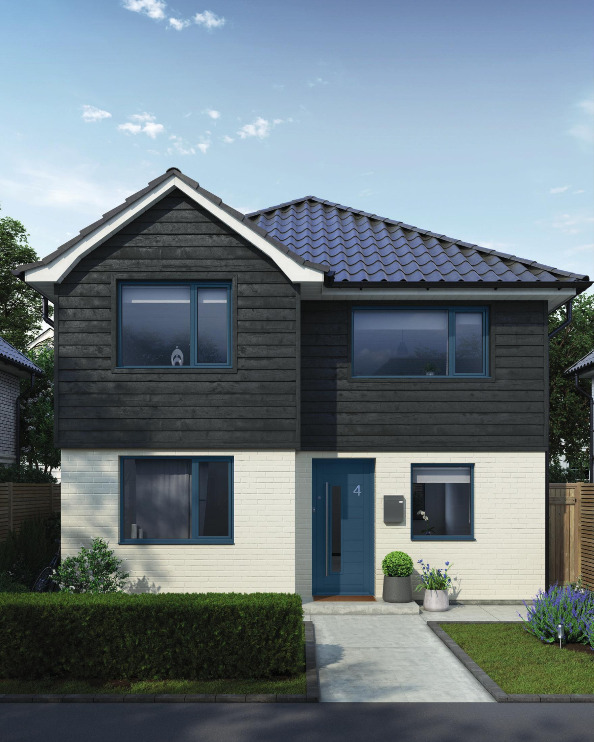
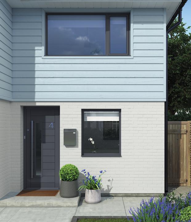
Modern minimalism
Highlight the sleek architecture of a modern home with a timeless and contemporary colour palette.
Sleek & Timeless
A fresh soft white, such as Timeless, is a perfect base on which to build the rest of a contemporary colour scheme. Enhance a modern home’s sleek appearance with timber cladding painted in Almost Black – a deep shade that creates a statement. For the front door and window trim, opt for a moody, blue-grey. We like Indigo Shade.
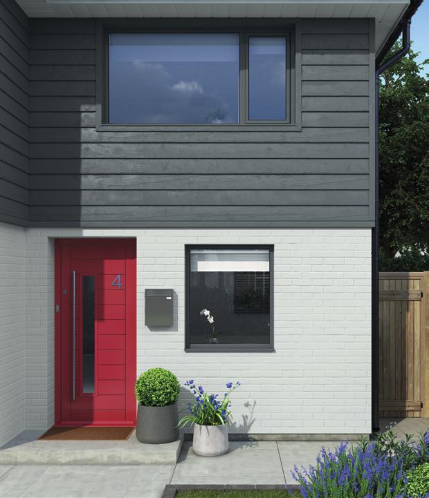
A colour pop
Recreate this look with a light grey shade on the walls such as Lunar Grey. You can offset this by choosing a dark, moody grey for timber cladding – we love the aptly-named, Thunder Clouds. For an eye-catching and dramatic colour pop against the greys that’s in keeping with a modern style home, go for a bright red like Pepper Red on the front door and window trim.
The dark side
A contemporary home calls for a sleek and unfussy colour scheme. Opt for an industrial-inspired light grey like Polished Pebble for the walls and complement with a deeper shade for timber cladding, such as Faded Denim. For the front door and window trim, create further contrast with a darker, stormy grey shade like Noble Grey, which brings a warm depth to the colour palette.
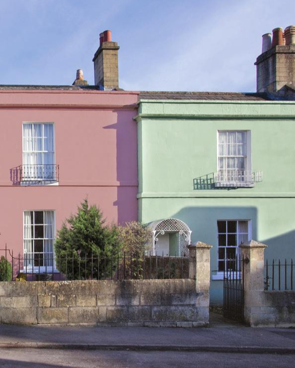
Beach retreat
Nod to the carefree style of the seaside with pretty pastels and cooler tones
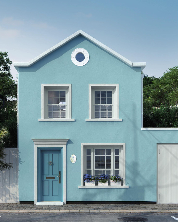
The new nautical
Take your colour cues from the sea and opt for a dreamy coastal blue on your walls, such as Rococo Blue, then highlight your trim using a pale grey or off-white shade – we love Drifting Cloud. For a stand-out door, a deep, washed out blue, such as Stonewashed Blue, creates a clean and smart look that will stand the test of time.

Ice cream shades
When painting your home, go for colours that are good enough to eat! Walls painted in a soft violet pink like Dusted Fondant make a sweet but subtle statement, which is complemented by the delicious Nutmeg White on the trim. For the front door, why not add a dollop of cool Grey Wisp to balance the warmth and complete this modern, yet classic, coastal look.

Beach Tones
Take inspiration from those clifftop walks with a palette that plays to the natural colours of the coast. For your walls, pick a stone grey shade, such as Silver Mint, then add contrast with trim that’s painted in a cheery yellow-green hue like Apple White . Finish with a lush, yet muted green on the front door – we love Dewy Lawn for a gentle and uplifting colour pop.
Victorian affair
Grand and dramatic with show-stopping facades, these period properties look great with richer hues.
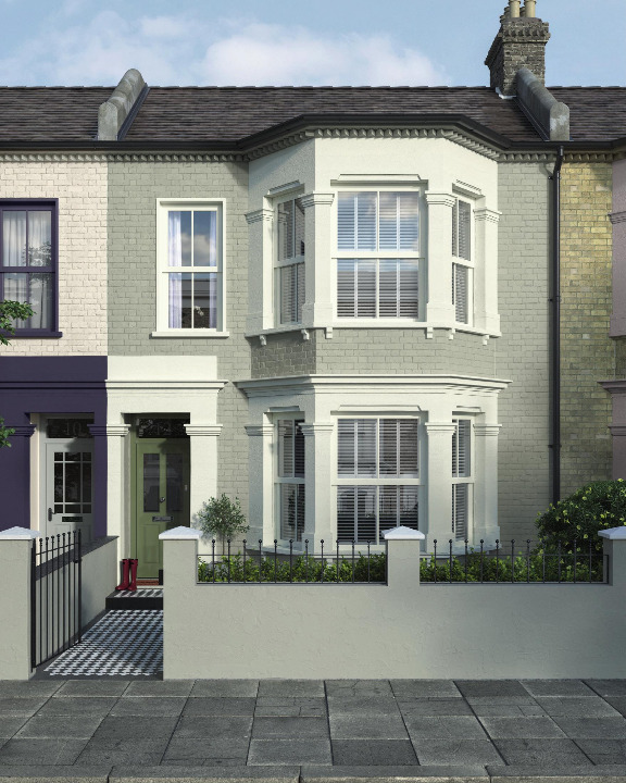
Rich in heritage
A mid-grey brick wall colour, such as Fossil Trace, looks great paired with Jasmine White on the trim, which creates a contemporary contrast, while highlighting those beautiful period features. Complete the look with a pop of colour on the door using a shade that’s steeped in heritage – deep greens such as Guild Green play to the era, while looking sleek and modern.
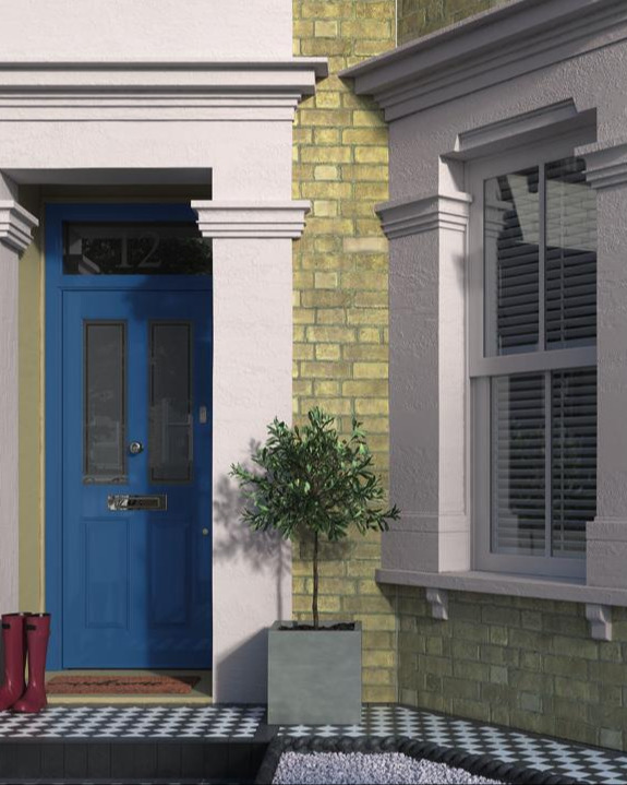
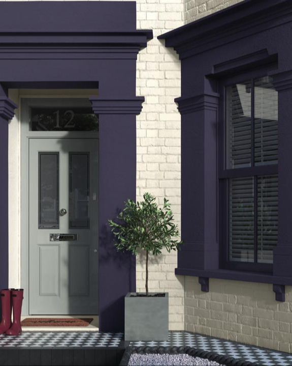
Regal Tones
When keeping the brick walls paint-free, you can still create an impact with standout trim. We love the sophistication of Chiltern Grey when used to highlight those beautiful period features around the windows and front door. A dark azure shade of Oxford Blue, used on the front door, creates an
elegant statement against a neutral backdrop that’s both warm and welcoming.
Classic Colours
You can’t go wrong with a neutral base on a property with so many beautiful features. Begin with
Summer Linen, a warm cream, as a base colour before painting the trims in an elegant darker shade for a contrast – we love Plum Compote. Then finish with a front door colour that complements the neutral scheme. Goosewing is an effortlessly timeless shade that still packs a punch